
A neutral color palette is king in home staging. And for small spaces, neutral colors help create an illusion of space and offer a blank canvas where homebuyers can imagine their own belongings.
Even though neutral colors are soft and less striking, they can still provide excellent visual appeal when used properly during staging. In this guide, we discussed the psychology of neutral colors, color combination tips, and mistakes you should avoid.
Why neutral colors work for small spaces
Neutral colors not only appeal to the broadest audience in the property market, but they can also do wonders in small spaces. Here’s how:
Making your space feel bigger
Neutral colors like soft whites, light grays, and beiges help your space feel larger because they reflect light better. When you use these colors on your walls and ceilings, they bounce light around the room, softening shadows and making edges less noticeable.
Aside from that, a neutral palette tricks homebuyers’ eyes into seeing more open space, so your room won’t feel cramped or closed in during showings.
Creating a calm, inviting atmosphere.
If you’re trying to make your small room feel relaxing, neutrals are a great choice. They don’t overwhelm the senses like bold or bright colors can.
Instead, they create a soothing background that makes homebuyers feel calm and welcome. This makes your space more attractive, especially for families looking for a cozy home.
Highlighting your space’s best features
Neutral tones give your room’s best features the chance to stand out. Whether it’s beautiful molding, hardwood floors, or a favorite piece of furniture, neutrals don’t compete for attention. They let these details shine, so your room feels thoughtfully put together without distractions.
Offering flexible styling options
One of the biggest advantages for you is how easy it is to decorate with neutrals. You can change your pillows, rugs, or artwork whenever you want without worrying about clashing with your wall color. This flexibility means you can update your style or try new trends while your house is on the market and waiting for a buyer.
Keeping your space looking neat and clean
Neutral colors help your home look well-maintained, so much so that it makes even small spaces feel move-in ready. Dark or flashy colors might show dirt or make a room feel heavy, but neutrals keep things light and organized, which is exactly what you want in a small area.
How to choose the best neutral color palette for small spaces
Not sure of the neutral color palette for your home? Each neutral color sets a different mood and suits different rooms or styles. Here’s a simple breakdown to help you choose:
Warm neutral color palette
Warm neutrals create a cozy, welcoming atmosphere that helps buyers feel emotionally connected to your home. They work well in areas where you want to encourage relaxation and connection, like living rooms and bedrooms. When staging, these colors tap into emotional warmth and comfort, helping potential buyers imagine themselves living there.
Warm neutral colors: Creamy beige, soft taupe, warm ivory, light caramel
Best for: Living rooms, bedrooms, reading nooks, spaces needing warmth and comfort
HolmeStage pro tip: Pair these warm neutrals with natural wood tones, cozy textiles, and soft lighting to boost your home’s warmth. However, avoid overly yellow or orange tones that can feel dated or too bright.
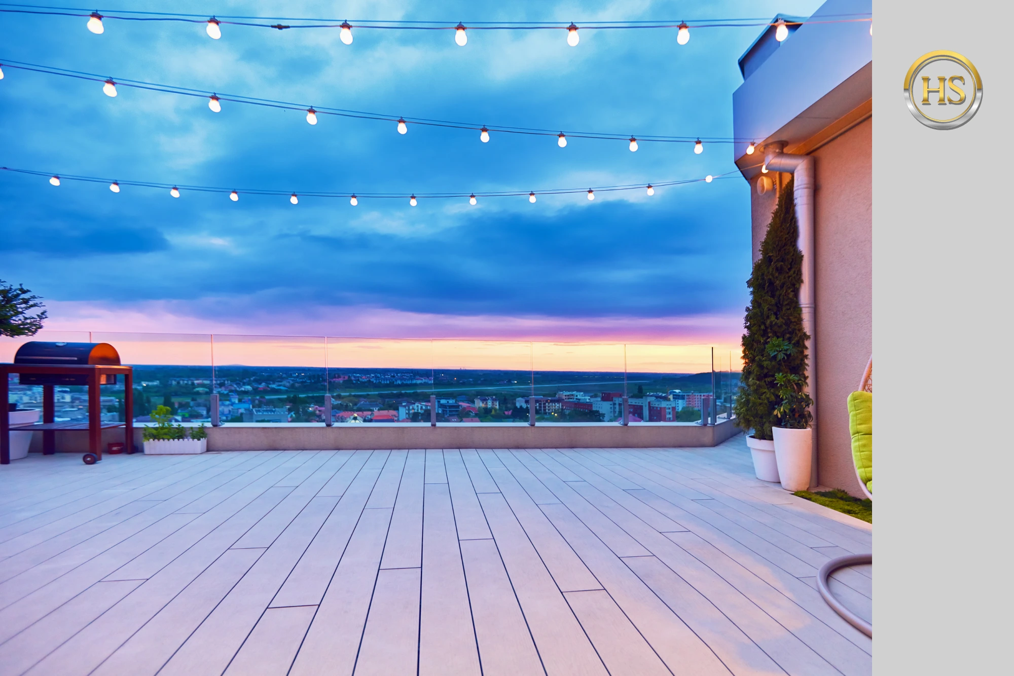
Cool neutral color palette
Cool neutrals give off a clean, fresh vibe that appeals to buyers who want a modern, well-maintained home. These shades suggest that your space is bright, open, and easy to care for. Also, homebuyers often associate cool neutrals with functionality, which can help them see your home as low maintenance.
Cool neutral colors: Light gray, soft blue, pale green, crisp white with blue or green undertones
Best for: Kitchens, bathrooms, home offices, or rooms needing brightness and airiness
HolmeStage pro tip: You can combine cool neutrals with sleek metal fixtures or glass accents for an extra modern touch. It also complements well with natural wood or plants, so your small space won’t look too cold.
Soft neutral color palette
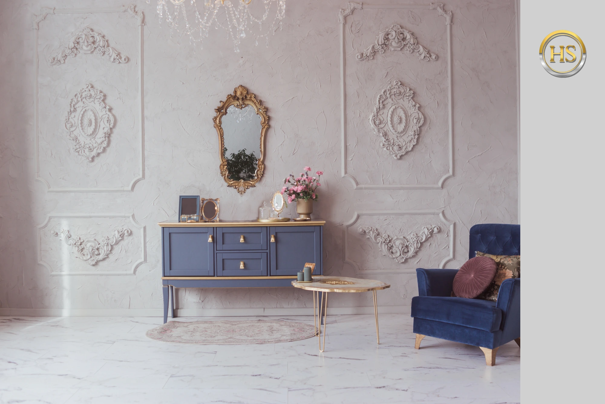
Soft neutrals strike a balance between calm and style, which can attract buyers who want a peaceful yet sophisticated living space. These muted hues add subtle personality to your space without overpowering it, making it a good palette for bedrooms or cozy nooks
Soft neutral colors: Blush pink, light greige (gray-beige), muted lavender, dusty blue
Best for: Bedrooms, cozy corners, spaces designed for relaxation
HolmeStage pro tip: You can layer soft neutrals with textured fabrics like velvet or linen to add depth.
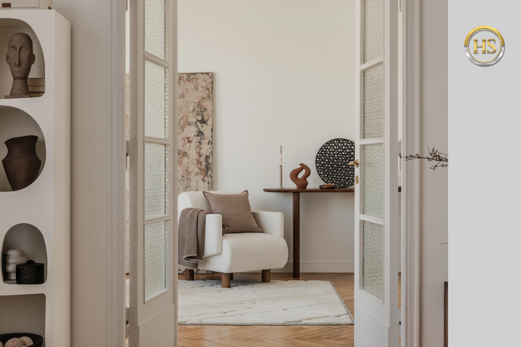
Modern neutral color palette
Modern neutrals appeal to buyers who prefer sleek, contemporary spaces. This palette makes small homes look stylish and up-to-date, which can be a strong selling point for young professionals. Perfect for urban apartments or minimalistic homes, this palette emphasizes clean lines and uncluttered style.
Modern neutral colors: Stark white, charcoal gray, black accents, warm stone hues
Best for: Urban apartments, modern living rooms, spaces aiming for contemporary style
HolmeStage pro tip: Keep your furniture simple and use dark accents sparingly to add contrast without overwhelming the small space
Mistakes to avoid in neutral color palette interior design
When working with neutral colors, it’s easy to commit mistakes that can make your small space feel dull or uninviting. Here are some of these common mistakes to watch out for and how you can avoid them:
1. Choosing neutrals that are too flat or bland
If you pick neutrals that lack any depth or variation, your room can feel lifeless and boring. Don’t just settle for plain beige or gray without considering undertones or textures. Instead, look for neutrals with subtle variations, like warm or cool undertones, to add richness and interest to your space.
2. Ignoring texture and layering
Relying solely on neutral paint or fabrics without mixing textures can make your space feel cold and uninviting. To avoid this, you can incorporate different materials like wood, metal, linen, velvet, or woven fabric.
Without texture and layering, even the best neutral colors can fall short in making a small space feel cozy and appealing.
3. Overusing one shade of neutral
Using just one neutral color throughout your small space will create a monotonous look. Instead, you can combine several complementary neutrals, like soft gray walls with warm beige furniture. This will create contrast and depth without being overwhelming.
4. Forgetting about lighting
Neutral colors look different depending on your indoor or natural lighting. Avoid choosing a neutral based only on how it looks in artificial light or just one time of day. Instead, test your colors under different lighting conditions to make sure they work well in your space all day long.
Make sure you use different types of lighting when staging a small space. You can combine task, accent, and ambient lighting, so your home will be well-lit when buyers visit at different times of day.
5. Choosing incompatible neutrals
Some neutrals work better in certain rooms or climates than others. For example, warm neutrals may feel too heavy if you have a small, north-facing room with little sunlight. Meanwhile, while cool neutrals might feel cold in your cozy living room.
Take note that neutral shades can still clash. For example, you pair a cool gray with a warm beige that has conflicting undertones. This will make the overall space feel off-balance and visually confusing.
6. Overloading on whites
White walls, white furniture, white décor— homebuyers will start wondering whether they are in a house or a hospital corridor. If you want a bright, airy space, balance white with other soft neutrals like greige or pale taupe.
You can also follow the 60/30/10 rule for color schemes, with no more than three main neutrals on your palette.
With this rule, the dominant color should be 60% of your color palette, usually used on walls, flooring, and large furniture items. Meanwhile, your secondary color should be 30% of your palette, which is typically the shade used on rugs, curtains, and upholstery. Lastly, 10% of your color palette should be accent colors like contrasting pillows, artwork, and other decorative objects.
7. Overusing glossy finishes
Take note that it’s not just about the shade, but also the finish. High-gloss finishes on neutral walls can create glare and highlight imperfections in your space. Meanwhile, matte or eggshell finishes tend to work better for neutrals, offering a soft, elegant look.
Still, you can use touches of gloss but avoid using it as your main finish when staging a house. If you want something reflective, big mirrors are your best bet for small spaces.
Need help? Book a home staging consultation with HolmeStage!
Creating a color palette for home staging can be tricky, but we’re here for professional help! At HolmeStage, we have expert interior designers who can craft the perfect neutral palette for your small space. We’ve staged 700+ properties in the Greater Los Angeles area with the most attractive color selections that homebuyers love!
So, if you want your interiors to look classy during showings, feel free to book a consultation. We provide the best home staging Los Angeles has to offer, including color consultation, interior design services, and full/partial staging, so you don’t have to worry about anything!
FAQs about home staging colors
What color makes your house look expensive?
If you want your house to look expensive, go for rich neutrals like warm greige, deep charcoal, or creamy whites. Deep blues and muted greens also bring a luxurious feel, especially when paired with crisp white trim or gold accents.
What color adds value to a home?
Colors that add value to a home are usually neutral and appealing to a wide range of buyers. Soft shades like warm beige, light gray, greige, and creamy whites work best. These colors create a clean, fresh, and versatile backdrop that helps buyers imagine their own style in the space.
What color makes a house look smaller?
Dark and bold colors tend to make a house look smaller. Shades like deep navy, dark brown, charcoal gray, or a green neutral color palette can also make a house feel enclosed.
What color makes a house look bigger?
Light colors make a house look bigger because they reflect more light, creating an open, airy feel. Shades like soft whites, pale grays, light beiges, and pastels can help brighten up your space and blur the edges of walls. You can use these colors on walls, ceilings, and large surfaces to visually expand your home, especially in smaller rooms.
What is the most attractive house color?
The most attractive house color often depends on location and personal taste, but classic neutrals tend to be the safest and most appealing choices. Colors like soft gray, warm beige, and crisp white appeal to more people than bolder shades. Also, adding subtle accent colors on doors or trim can boost your home’s curb appeal even more.
What is the hardest house color to sell?
The hardest house colors to sell are usually very bold, dark, or unusual shades that don’t appeal to most buyers. Bright neon colors, intense reds, dark purples, or very dark browns can make your home feel overwhelming or too personalized. Take note that intense and strong colors can lower your home’s market value.
Should I paint every room the same color?
You don’t have to paint every room the same color, but using a cohesive color palette throughout your home can create a smooth, connected feel. For small spaces, you can stick to similar neutral tones to make the entire home feel bigger and more open. You can also add variety by using slightly different shades or accent walls in certain rooms to give each space its own character.
Is it okay to paint the ceiling and walls the same color?
Yes, it’s okay to paint your ceiling and walls the same color, especially if you want to create a seamless and cozy look. Typically, using the same color can make the space feel taller or more unified. Just keep in mind that lighter colors work best for this to avoid making the room feel closed in. If you prefer contrast, painting the ceiling a lighter shade than the walls can also brighten and open up your space.